Overview of respiration data preprocessing and analysis#
This tutorial covers a basic pipeline for preprocessing and analysis of respiration data collected during a experimental task.
First, we import the necessary Python modules:
[23]:
import numpy as np
import pickle as pkl
import matplotlib.pyplot as plt
from pyriodic.preproc import RawSignal
from pyriodic.viz import plot_phase_diagnostics, CircPlot
from pyriodic.phase_events import create_phase_events

from pyriodic.datasets import sample
Load in data and create RawSignal object#
The first step is to load in the respiration time series data. Together with the sampling frequency, this is used to create a RawSignal object. This object holds many useful methods for preprocessing the raw data.
[24]:
path = sample.data_path()

with open(path, "rb") as f:
    data = pkl.load(f)

behav_data = data["behav_data"]
resp_ts = data["resp_ts"]
sfreq = data["sfreq"]
event_samples = behav_data["event_samples"]
event_ids = behav_data["event_ids"]

raw = RawSignal(resp_ts, sfreq)
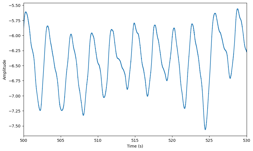
The RawSignal object has a built-in plotting method that allows you to visualise the data. You can specify the start time and duration of the segment you want to plot. If no arguments are provided, it will plot the first 20 seconds of the signal.
[25]:
# defining a few keywords for plotting the raw signal and the phase diagnostics passed to the plot function
preproc_plot_kwargs = {
    "start": 500,
    "duration": 30,
}
[26]:
plot = raw.plot(**preproc_plot_kwargs)
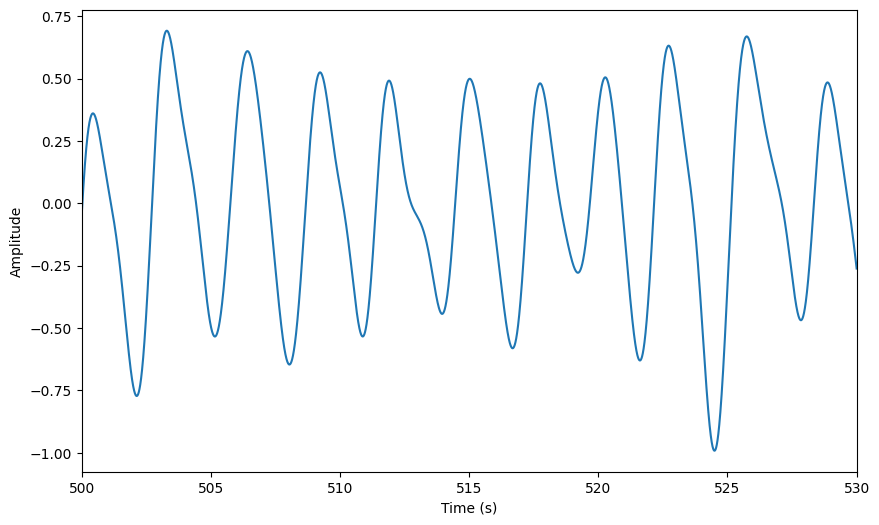
Preprocessing#
[27]:
raw.filter_bandpass(low = 0.1, high = 1)
plot = raw.plot(**preproc_plot_kwargs)

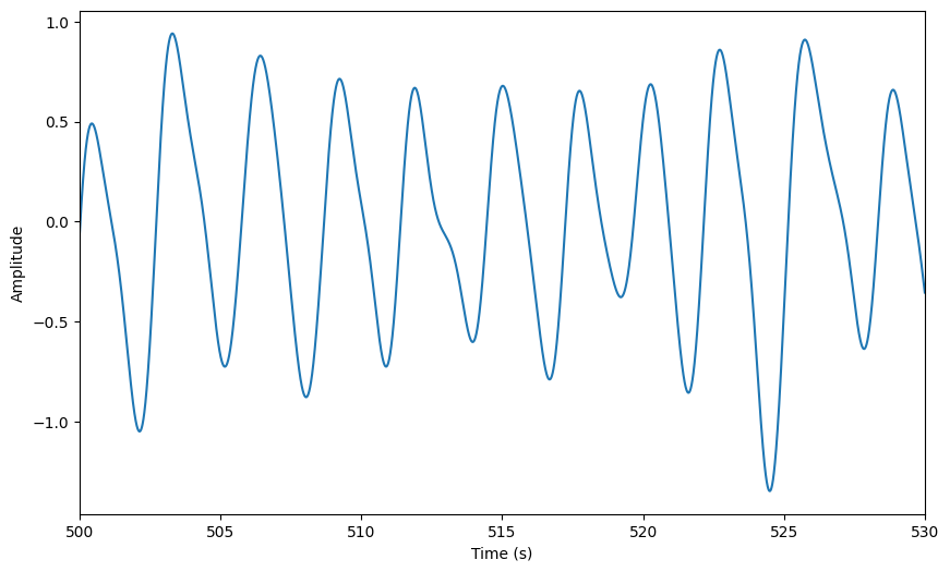
[28]:
raw.smoothing(window_size=500)
plot = raw.plot(**preproc_plot_kwargs)
[29]:
raw.zscore()
plot = raw.plot(**preproc_plot_kwargs)
As the data is modified in-place, the original signal is lost. If you want to keep the original signal, make a copy before applying any modifications. To see which modifications have been applied to the signal, you can print the history:
[30]:
raw.history
[30]:
['bandpass(0.1 Hz - 1 Hz)',
 'Smoothing has been applied with a window size of 500 ms',
 'zscore()']
Extract phase angles#
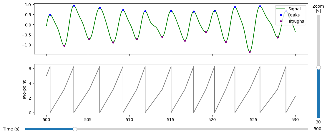
There are several ways to extract phase angles from the respiration signal. We will use the recommended two-point method, which linearly interpolates the signal from peak to trough from \(0\) to \(\pi\). and trough to peak from \(\pi\) to \(2\pi\).
For a review of the different methods, see the phase extraction tutorial.
[31]:
phase, peaks, troughs = raw.phase_twopoint(
    prominence=0.5,  # play around with these parameters if the peak detection is not satisfactory
    distance=0.5
    )
[32]:
plot = plot_phase_diagnostics(
            {"Two-point": phase},
            start = 500,
            window_duration = 30,
            fs = raw.fs,
            data = raw.ts, #the preproccessed data
            peaks=peaks,
            troughs=troughs
        )
Now, we will extract the phase angles corresponding to the events of interest. This will allow us to analyse the whether the respiration phase is aligned with the timing of the stimuli presented during the task.
To acheive this, we first need to get the event timings. In the data used for this tutorial, the events are stored in a numpy array with \(n\) rows and 3 columns. The first column holds the the sample index of the event, and the third column holds the trigger value (i.e. an integer that identifes the type of event).
To make it easier to understand the data, we will convert the trigger values into a list of event labels.
[33]:
event_mapping = {
    # 3 salient stimuli leading up to the target
    1: 'stim/salient',

    # target can be presented at two locations (middle vs. index finger)
    6: 'target/middle',
    10: 'target/index',

    # responses can be correct vs. incorrect
    56: 'response/index/correct',
    84: 'response/middle/incorrect',
    52: 'response/middle/correct',
    88: 'response/index/incorrect',

    # experiment control events
    128:'break/start',
    129: 'break/end',
    254: 'experiment/start',
    255: 'experiment/end'
}

event_labels = [event_mapping[trig] for trig in event_ids]
[35]:
unique_labels = np.unique(event_labels)
print("Unique event labels:", len(unique_labels))
Unique event labels: 11
Now that we have our event labels and the phase angles, we can find the phase angles corresponding to the experimental events.
[36]:
circ = create_phase_events(
    phase_ts=phase,
    events=event_samples,
    event_labels=np.array(event_labels),
    rejection_method = 'segment_duration_sd', # excludes events during inspiration/exiration segments whose durations deviate more than `rejection_criterion` standard deviations from the mean
    rejection_criterion = 3
)
Rejected 150 out of 2060 events (7.3%)
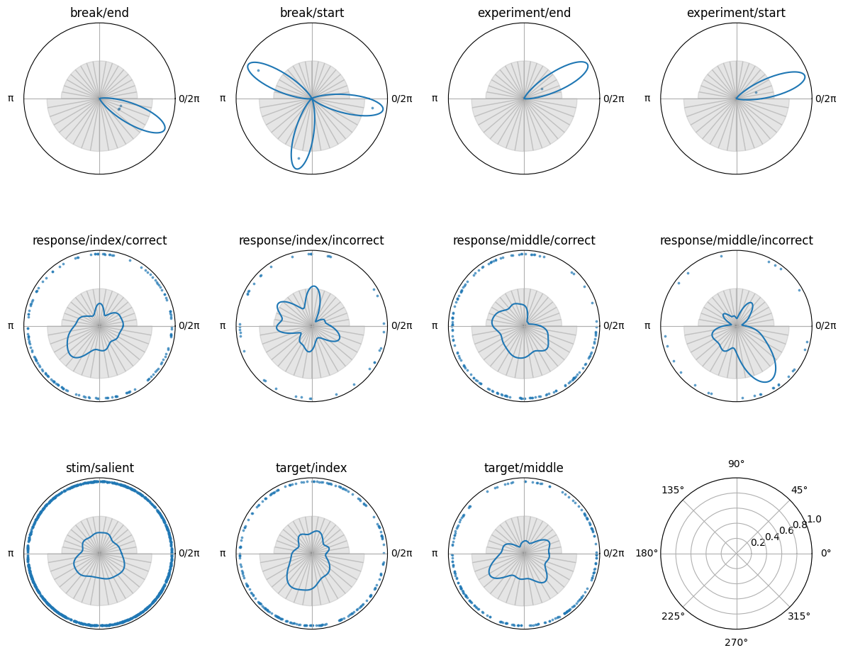
The Circular object has a plotting function, so we can visualise the phase angles at the time of the events. This will allow us to see how the phase angles are distributed across the different event types.
[37]:
# find unique labels
unique_labels = np.unique(circ.labels)

fig, axes = plt.subplots(
    3, 4,
    figsize=(12, 10),
    subplot_kw={'projection': 'polar'},
)

for ax, label in zip(axes.flatten(), unique_labels):
    print(f"Plotting label: {label} with {np.sum(circ.labels==label)} events")
    circplot_tmp = CircPlot(
        circ=circ[label],
        ax=ax,
        title=label
    )
    circplot_tmp.add_points(s = 3, alpha = 0.6)
    circplot_tmp.add_density()
    circplot_tmp.add_histogram(phase)

# remove empty subplots
for ax in axes.flatten():
    if not ax.has_data():
        ax.remove()

plt.tight_layout()
Plotting label: break/end with 2 events
Plotting label: break/start with 1 events
Plotting label: experiment/end with 1 events
Plotting label: experiment/start with 1 events
Plotting label: response/index/correct with 191 events
Plotting label: response/index/incorrect with 6 events
Plotting label: response/middle/correct with 112 events
Plotting label: response/middle/incorrect with 46 events
Plotting label: stim/salient with 1168 events
Plotting label: target/index with 208 events
Plotting label: target/middle with 174 events